
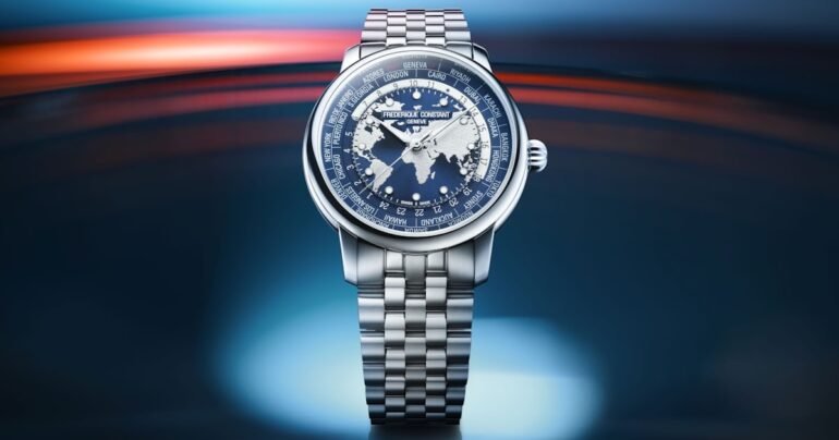
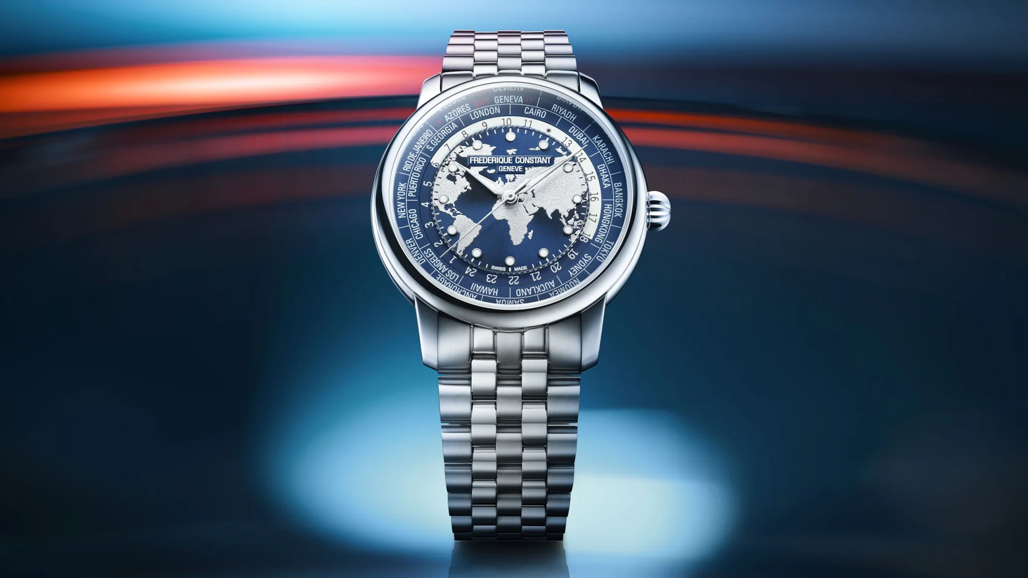
This new revamp of the Worldtimer is a very nice move, with a design that I think is much improved with the removal of that date subdial. I feel like there’s always a debate about whether to have a date on a worldtimer, so those arguing against it will surely be pleased here.
From a design standpoint, I also think removing the bottom subdial cleans up the look, where the center dial, with oceans, continents, and those applied indices, gets the biggest visual focus, and the depth there is emphasized. My pick of the bunch is the lighter blue with taupe continents, though it’s surprising it’s not offered on the steel bracelet, given it’s priced the same as the other blue dial with a bracelet.
TanTan Wang
2026-04-15 13:00:00