
My appointment with Parmigiani Fleurier at last year’s Watches & Wonders was one of those meetings where it all kind of clicked for me. I loved those perpetual calendars they introduced, and for the first time since I’ve been working in the watch industry, the insider hype around Parmigiani really began to make sense. They are one of the ultimate “if you know you know” brands, at least among the mainstream exhibitors at Watches & Wonders, but they had always kind of eluded me.
This year’s big novelty was a very interesting chronograph that I wrote about here. I saw that watch, of course, and it’s very special. The movement is mindblowing – there’s simply no other chronograph quite like it, and it kind of takes seeing it in action to fully comprehend. It’s ability to go from a simple time only three hander to a five handed ultra complicated never before seen chronograph execution in a literal blink of an eye (and back again) is incredibly cool.

But, I have to say, with every Tonda PF release, I become more aware that it just isn’t the corner of Parmigiani that appeals to me. The case just doesn’t really work on my wrist or sing to me in the way other similar watches sometimes do. The Toric, on the other hand, always does. This really feels like the distillation of what the brand is about, or at least how I understand it. The case is remarkably simple at a glance, but close examination reveals that every detail is flawlessly executed, with the best example being the hand knurled, polished bezel, which has been a signature of the brand since the very beginning. Inspired by Greek architecture, the bezel has a hand-mande substance to it that is tough to describe, but easy to see in the way it catches the light. It’s of course part of other watches in the Parmigiani collection (including the Tonda PF) but it’s most coherent on the inherently dressy and old-fashioned Toric.
This year, Parmigiani celebrated the 30th anniversary of the Toric with three limited edition releases with hand hammered gold dials. All three of the watches in the Toric Anniversaire collection feel like extensions of where the Toric, and the brand more broadly, have been heading in recent years, which is a slightly more contemporary interpretation of traditional high end “luxury” watchmaking. I’ve put “luxury” in scare quotes here because these watches are actually quite subdued, by design, and fit what I think is a more enthusiast focused definition of the term, which is something carefully made by hand to a very high standard, as opposed to an object that exists to flaunt wealth (although, to be sure, these watches are eye poppingly expensive).

First up is a new edition of one of my favorite watches from last year, the Toric Quantieme Perpetual. This execution is in a 40.6mm rose gold case that measures just 10.9mm tall. The dial is in a gold toned color that the brand calls Bright Peony. It’s a lot of gold, and a little more ostentatious than last year’s pastel QPs, but the actual execution of the perpetual calendar complication via the PF733 caliber is still, of course, very appealing in its minimalism.
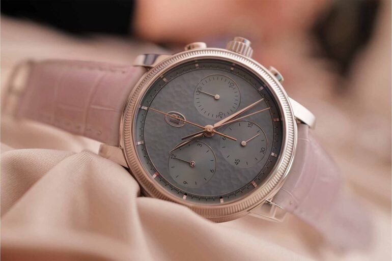
Next is the Chronographe Rattrapante Anniversaire, which has a platinum case measuring 42.5mm in diameter. The dial here is in Agave Blue, and to my eye is probably the best of the bunch in representing the unique texture of the hand hammered dial making process. That’s largely due not only to the color, which I found picked up light in a really interesting way, but the way the textured surface contrasts with the subdials which have a flat, sunburst finish. All three watches have at least one of these subdials, but the impact is most dramatic on the chronograph simply because it has three of them. To me, the Chronographe Rattrapante Anniversaire stretches the bounds of what a Toric should be just slightly, given its size, but the weight and finishing of the large platinum case is certainly very impressive.

My personal favorite of the bunch is the Petite Seconde Toric Anniversaire in platinum. This watch has a 40.6mm platinum case measuring 8.6mm thick. It wears wonderfully, although I’d love to see it in a very slightly smaller size. The dial is in a shade Parmigiani has designated as Morning Blue, and it works really well with the luster of the platinum case, and feels at home with some of the softer pastel work the brand has introduced in the last few years.

I know we all sound like broken records in the aftermath of Watches & Wonders, constantly explaining that the watches need to be seen in the metal to truly be appreciated, but that’s a very real thing. There’s just only so much that photos and words can capture, and these watches by Parmigiani have intangible qualities in their details that make them very appealing. The way the applied logo is finished on each dial, for example, is more intricate than you’d expect, even on a watch at the price point PF is asking. And the movements are finished immaculately, and in solid gold, which not only makes them visually arresting (all that precious metal…) but has a not so subtle impact on the total weight of each watch on the wrist, which is truly something that needs to be felt to fully wrap your head around. You expect a watch in platinum to be a certain weight, and then it’s actually denser and heavier than you thought it would be.
This all comes at a price, and in the bubble of the Palexpo, you can convince yourself it makes sense. The Petite Seconde retails for CHF 75,000, the Quantieme Perpetual for CHF 113,000, and the Chronographe Rattrapante comes in at CHF 158,000. So, alas, I’m not a buyer for any of these, and all are objectively incredibly expensive. Retail price aside, however, they represent a great deal of traditional hand-made watchmaking (particularly case and dial making, which is increasingly rare to see even at very high price points) and were among my favorite watches, once again, at Watches & Wonders 2026. Parmigiani Fleurier
Zach Kazan
2026-04-24 14:00:00