
When I heard Gagà Laboratorio was launching its first dive watch, the Aqualab, I was skeptical. The brand’s distinct identity made me question how it would translate into a sportier, tool-oriented direction. That’s a testament to how unique its design language is—not a criticism of its existing watches.
The Labormatic, for example, always struck me as a sportier take on something that still felt rooted in a more classical and slightly dressy world. I spent time with the Azzuro last year and was suitably impressed. That’s why the new Aqualab caught me off guard in the best possible way. Because looking at the press images, this doesn’t feel like a brand stretching awkwardly into a category that doesn’t quite suit it. It feels like Gagà Laboratorio has actually taken the time to work through how its design codes could evolve into a proper dive watch without losing the thing that makes its watches recognizable in the first place. The brand describes the Aqualab as its move into the world of diving watches while holding onto a strong aesthetic identity, which, for once, doesn’t feel like empty marketing spiel.
The Aqualab still feels unmistakably Gagà
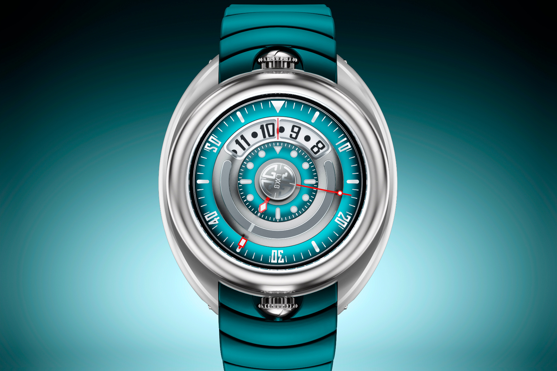
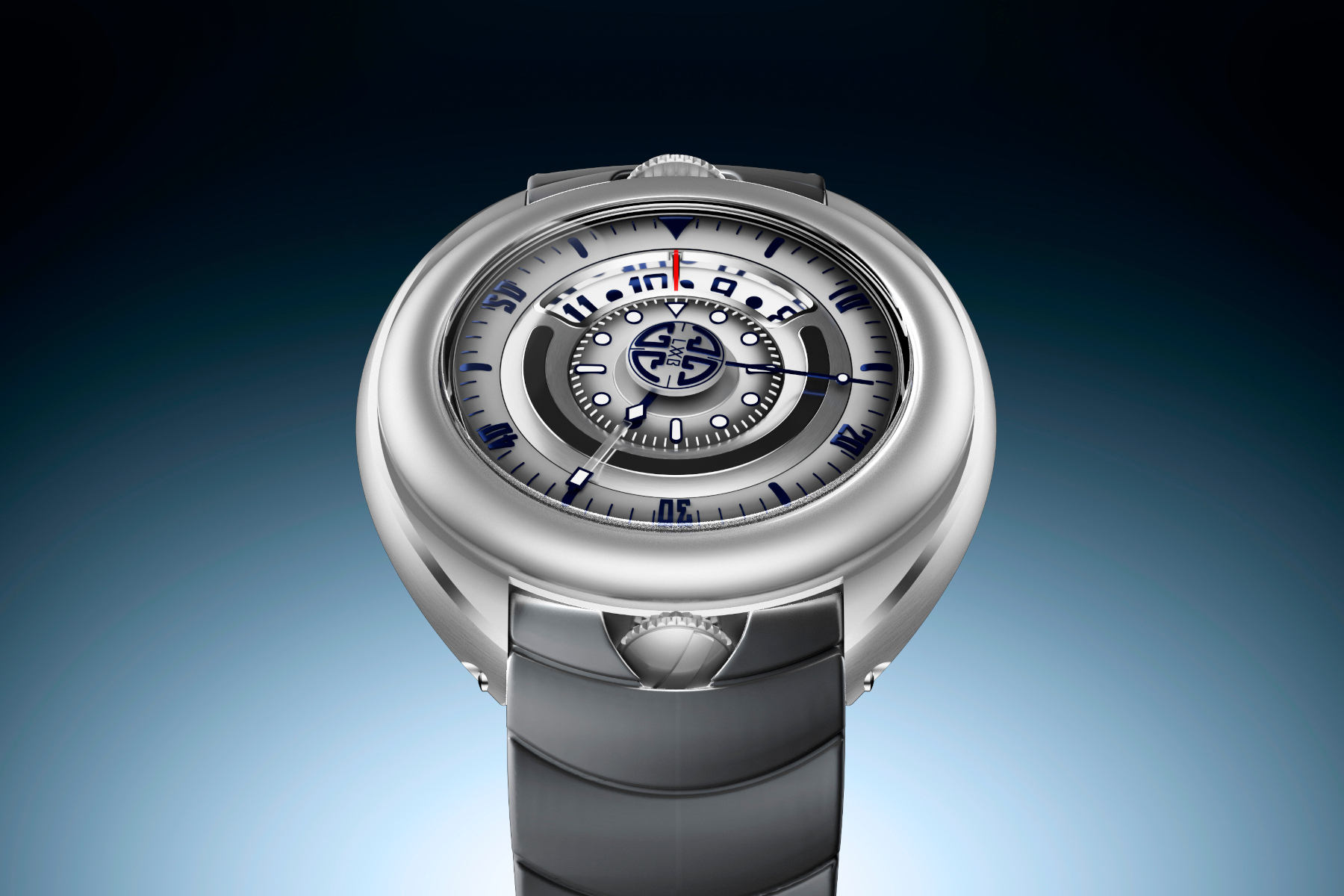
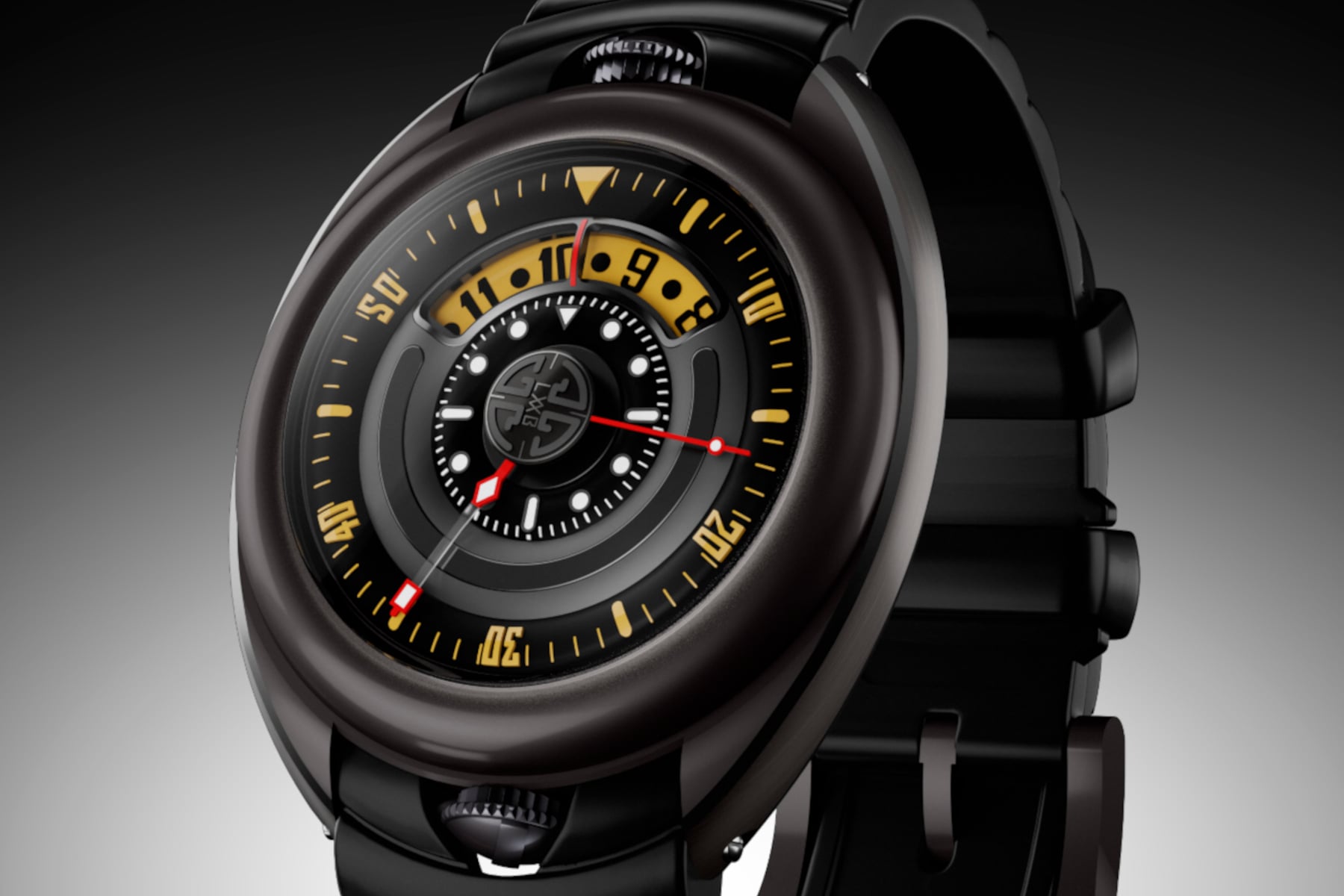
That’s the part I find most impressive here. Making a sporty watch isn’t hard. Plenty of brands can do that. Making a sporty watch that still feels like it belongs to your own universe is a different challenge entirely. The Aqualab still looks unmistakably like a Gagà Laboratorio creation. The rounded, sculptural case shape is the first thing that jumps out, and it avoids the trap of mimicking the usual dive-watch formula too closely. The brand talks about fluid transitions, balanced proportions, and sculptural volumes, and in this case, that actually lines up with what I see in the photos. The whole thing looks soft-edged and intentional rather than sharp, aggressive, or overbuilt.
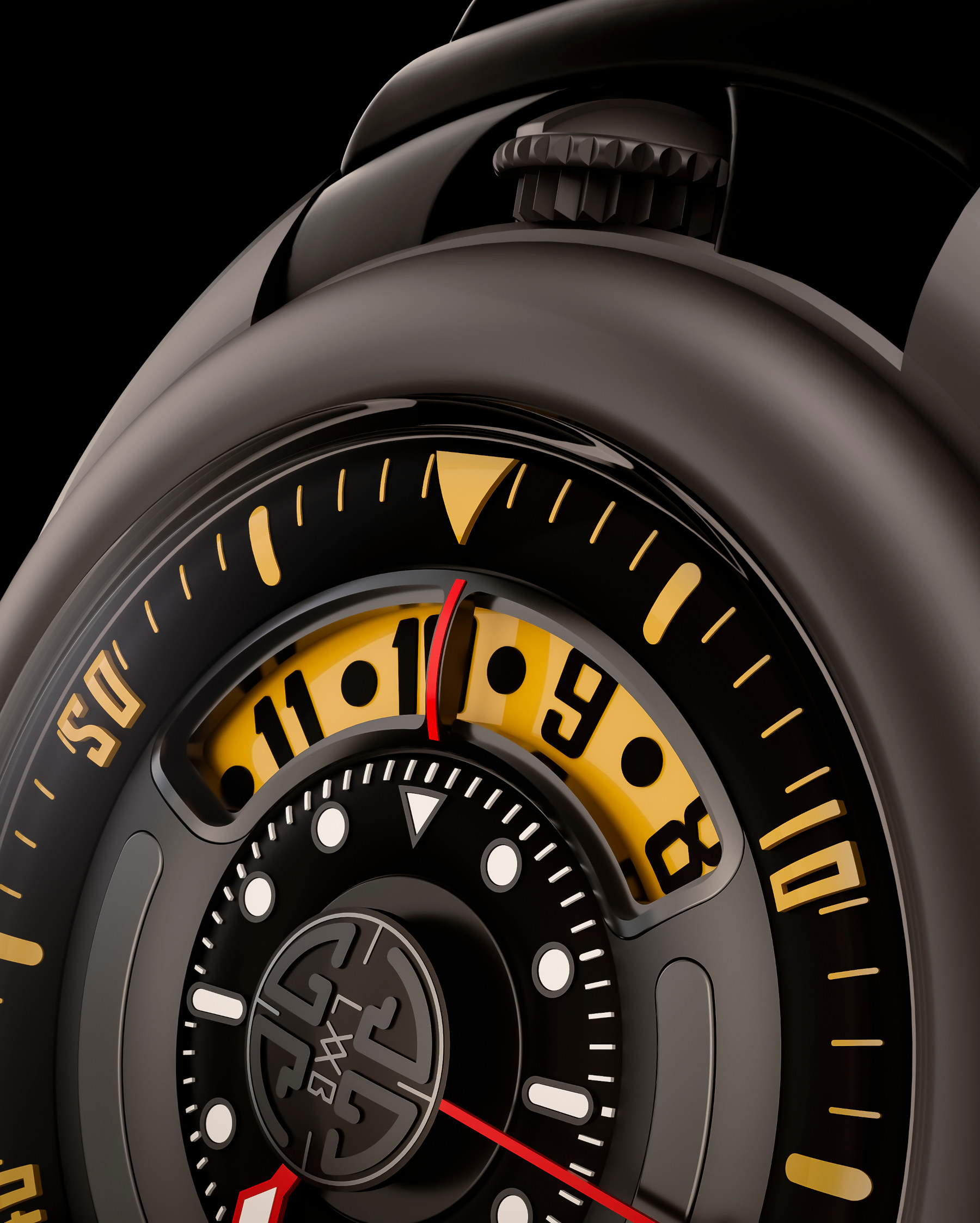
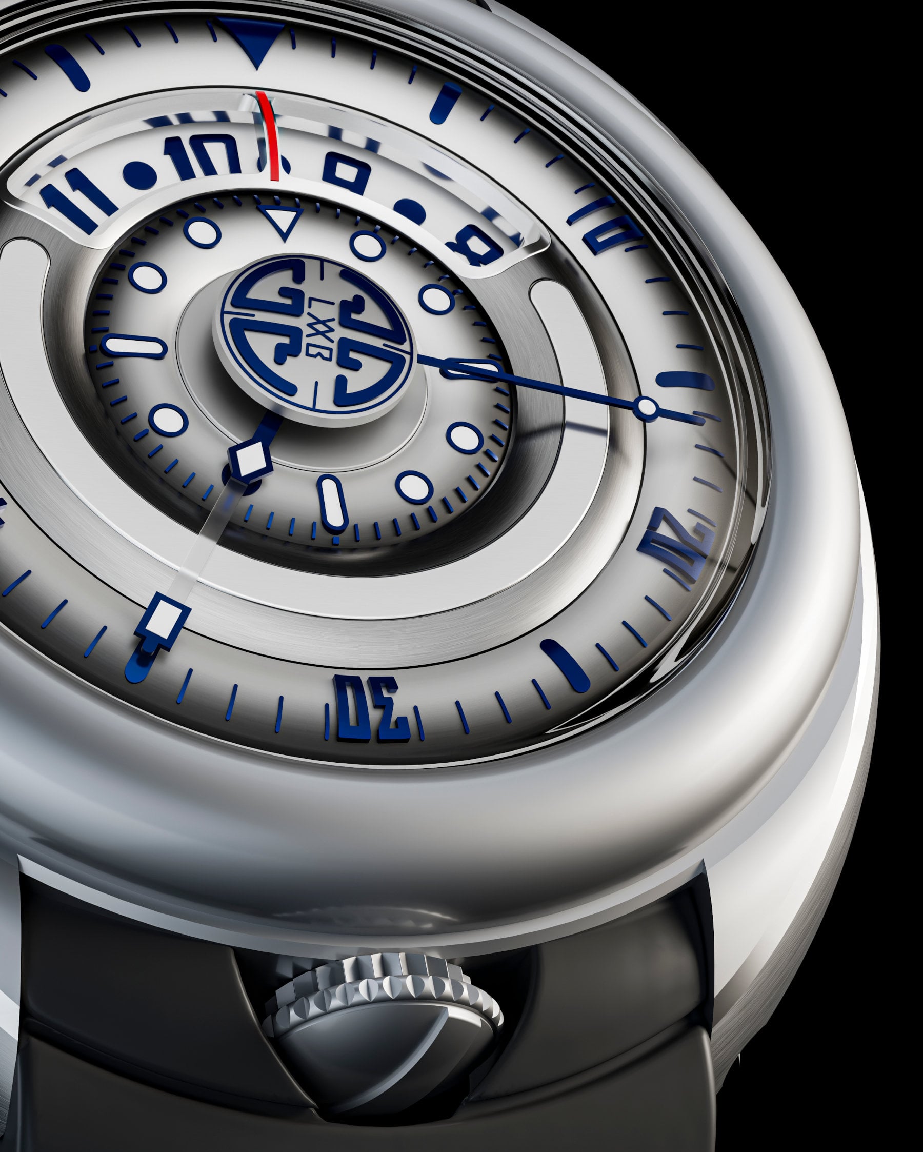
The dual-crown layout is also a clever move. The top crown handles the time while the other adjusts the internal rotating dive bezel, helping preserve the case’s smooth silhouette, which is such a big part of the watch’s identity. Had Gagà gone with a more conventional external bezel, I think a lot of that visual coherence would’ve disappeared.
The Aqualab design shouldn’t work this well, but it does
What I like most is that Gagà hasn’t flattened out its personality just to look credible in the dive-watch market. The Aqualab still feels expressive and “on-brand”. It still has that slightly theatrical, design-led quality the brand leans into, but it’s been tightened up and directed in a succinct way.
The display plays a big role in that. You’ve got digital hours, analog minutes, a central seconds hand, and a layered central architecture that gives the whole dial a lot of depth. According to the technical sheet, the watch uses a digital hour and analog minute display, with the indications treated in Super-LumiNova, alongside a central seconds display. That layout doesn’t read like a conventional diver because it clearly isn’t trying to be one. Instead, it feels like Gagà has taken the broad idea of a dive watch and interpreted it through its own lens.
That balance is harder to get right than it looks. Plenty of unusual watches are unusual because they’re trying too hard. This one feels more considered than that. Even when it gets playful, there’s still enough restraint to stop it tipping over into novelty. Gagà describes the Aqualab as functional and emotional, technical yet expressive. To be honest, I do think the watch visually lands somewhere in that territory.
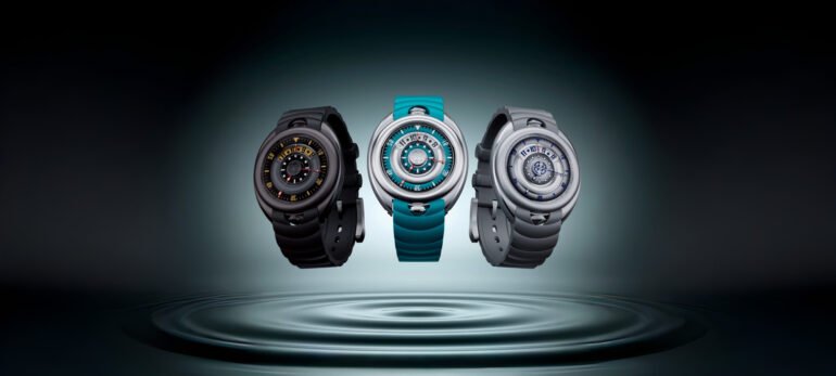
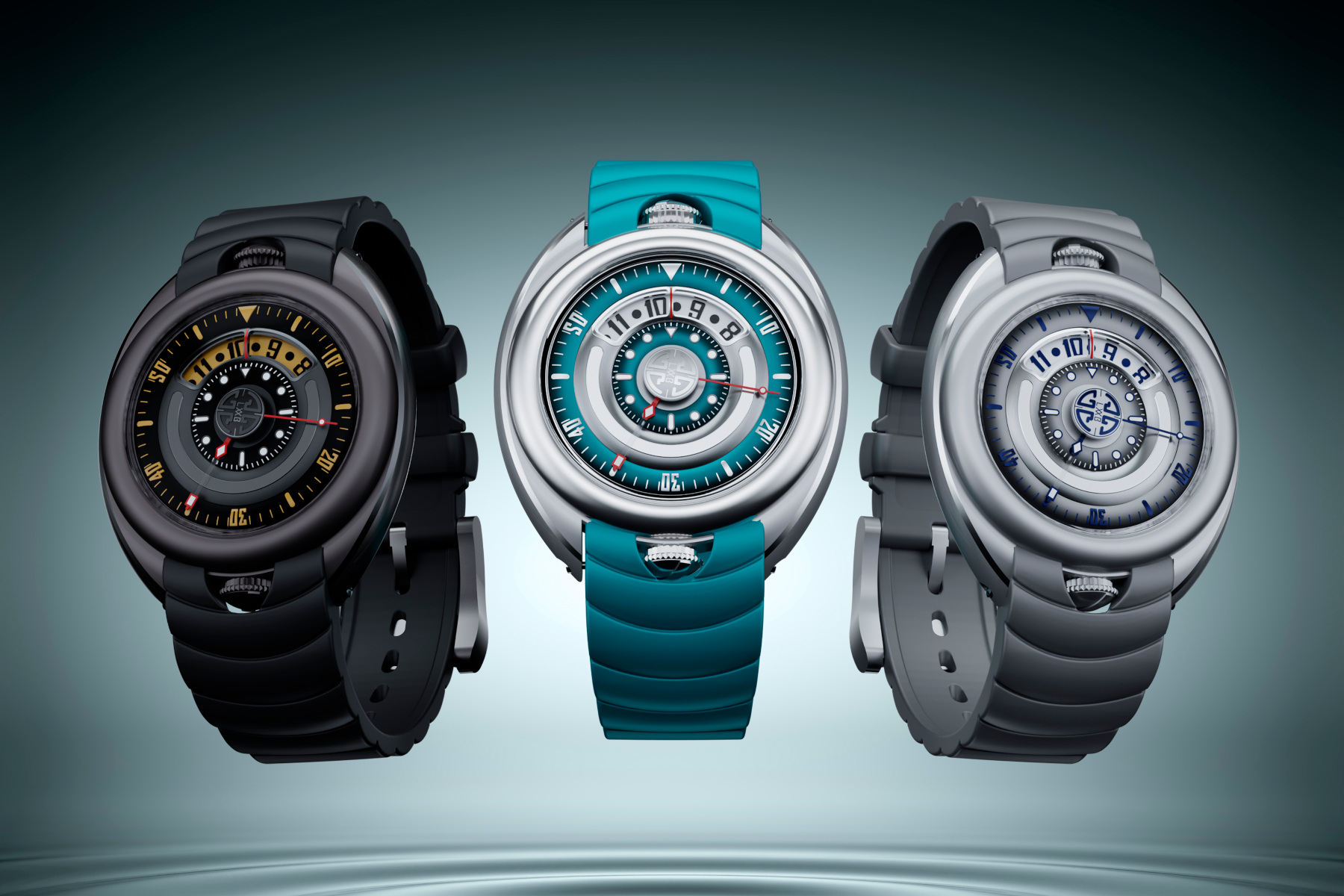
The black one is still my pick
All three versions look strong, which isn’t always the case when a brand launches a new model family in multiple colorways right out of the gate. Usually, one feels like the obvious hero, and the others feel like variations for the sake of filling out the range. Here, I can see the appeal in all of them.
The Aquamarine is probably the most summery and immediately eye-catching. The brand describes it as a “luminous interpretation inspired by coastal waters and Mediterranean summers”, which sounds legit. The Silver Grey and Blue version comes across as cooler, cleaner, and probably the easiest to wear if you want the most understated take on the design. Gagà positions that one as the “discreetly elegant and metropolitan” option. Again, a fair take.
But for me, the Anthracite is the one. I don’t often go for fully blacked-out watches because they can end up looking a bit too much. This one doesn’t. The blacked-out case, combined with those warm yellow-toned accents, gives it real contrast and enough visual bite to stop it from feeling dead on arrival. The red seconds hand helps too. Out of the three, it’s the version that feels the most complete to me, and probably the one that best shows how well this design language can adapt to a slightly tougher brief.
There’s substance behind the styling too
Of course, a watch like this still has to back up the visual story with enough proper dive-watch credibility, and on paper, the Aqualab does a decent job of that. It comes in a 44mm steel case, measures 15mm thick, offers 200 meters of water resistance, and uses a double-curved anti-reflective sapphire crystal. Inside is the La Joux-Perret G100 automatic movement with a 68-hour power reserve. The strap is made of HNBR rubber, and pricing is CHF 3,900 before VAT. If you’re keen to pick one up, you can do so through the official Gagà Laboratorio website.
Yes, 44mm will be a sticking point for some people. Fair enough. It’s not a small watch, and there’s no point pretending otherwise. But visually, at least from the images, the rounded case architecture does soften that a little. This isn’t one of those watches that looks like it’s trying to wear its size as a badge of honor. More importantly, it doesn’t feel like the specs have been thrown in just to support a styling exercise. There’s enough here to make the concept credible. I’ll know for sure later this week, when I get to see all three versions in hand at a preview evening during Watches & Wonders. I’m honestly pretty excited to see how they hold up in real life.
Genre shift complete!
As first attempts at genre shifts go, I think this is genuinely impressive. A dive watch from Gagà Laboratorio could easily have felt awkward. Instead, the Aqualab looks like a watch that the brand has properly thought through. More than that, it looks like one that understands how to carry its existing identity into a new category without watering it down.
Dave Sergeant
2026-04-13 05:30:00