
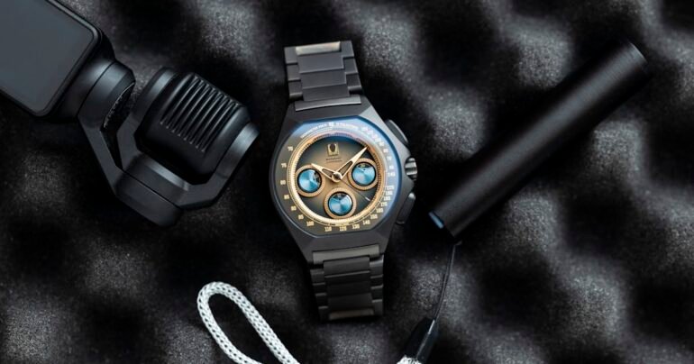

The mystery-style subdial shields don’t really require a closer look, as their bright blue shapes leap off the dial, each with a small cutout and a coordinated marker that reveals the number underneath. I’m tiresomely on record as not being a fan of chronographs, and part of that is because I find them annoying to read and, visually, often a mess.
Here, while there might be a cost to pinpoint accuracy compared with a traditional hand, the dial remains quite clean, and I had little trouble glancing at a given measure. Combine this execution with the bold, easily legible hour/minute handset, and you have a watch that is quite easy to use as a watch, functions well as a chronograph, and never seems to lose the plot when it comes to the design brief. I state this out loud because it’s not easy to accomplish. Add more text, a date, or even more color, and I think the effect becomes compromised.
James Stacey
2026-01-30 16:00:00